PayPal.com Website
Building the system that made a new brand work on the web
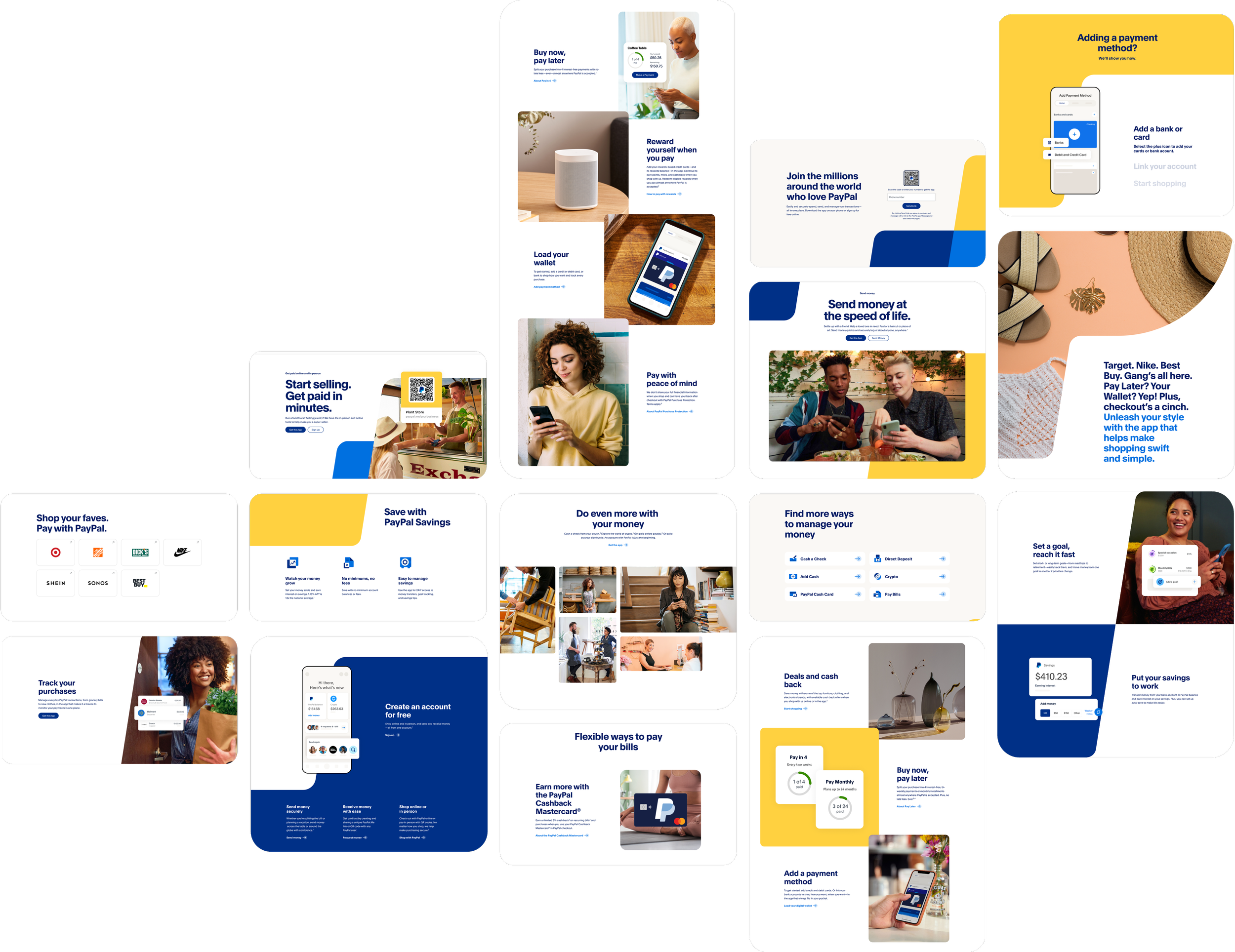
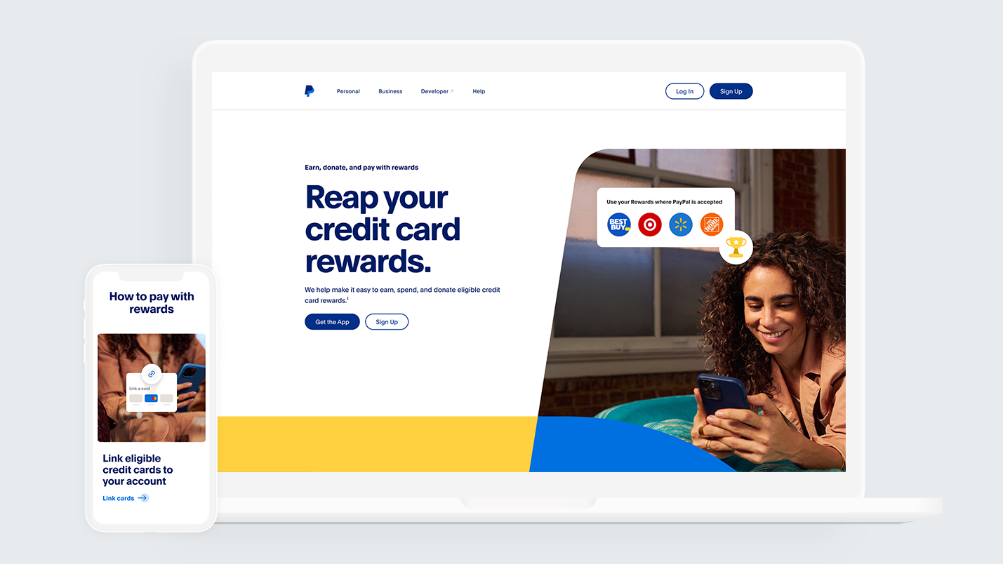
Over a year-long engagement I led the team that redesigned the PayPal website and scaled their new brand across web and mobile. The work transformed early guidelines into a cohesive, accessible and vibrant digital experience, driving stronger storytelling, a scalable design system and higher engagement.
01 The problem
No digital brand precedent
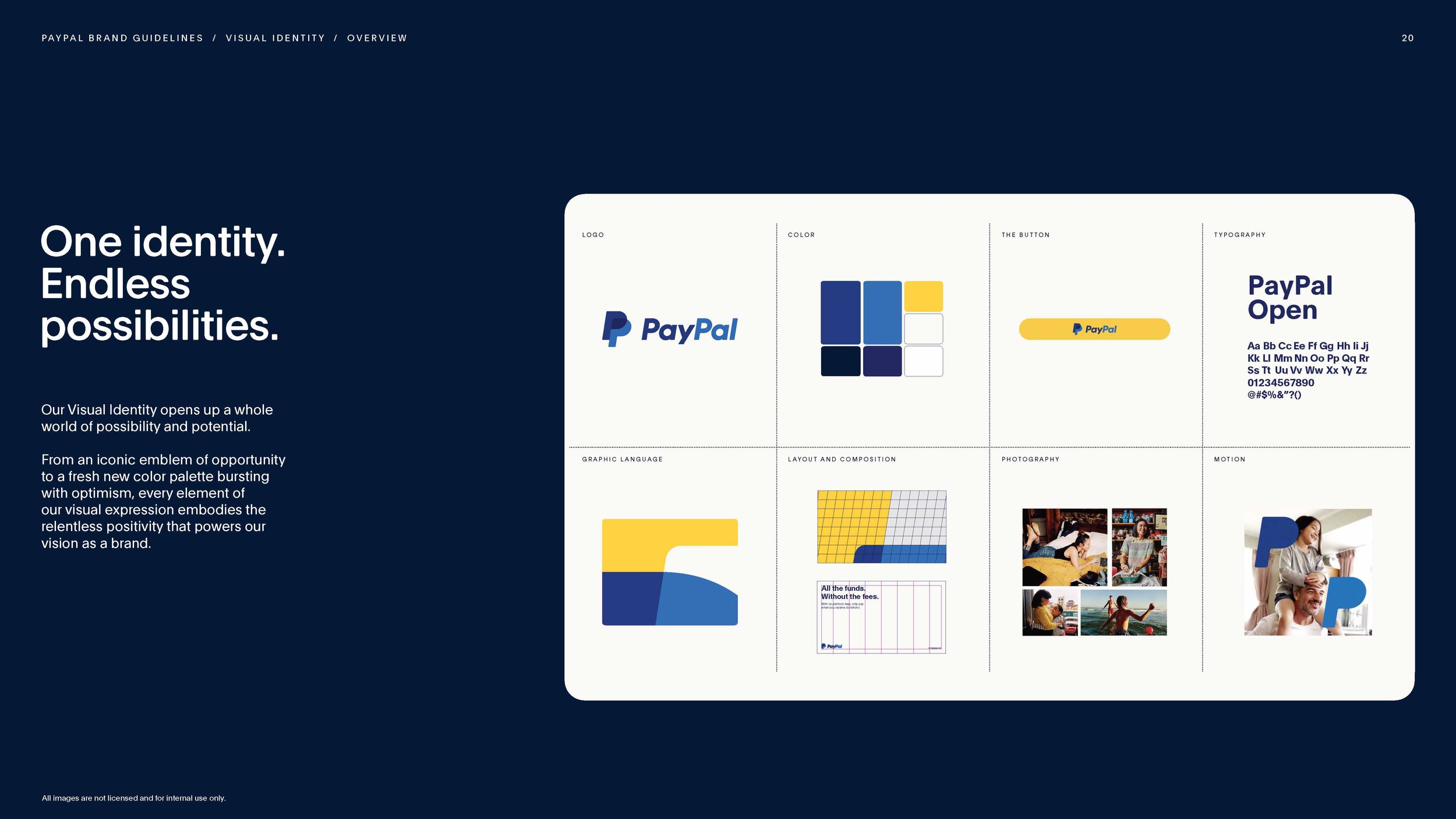
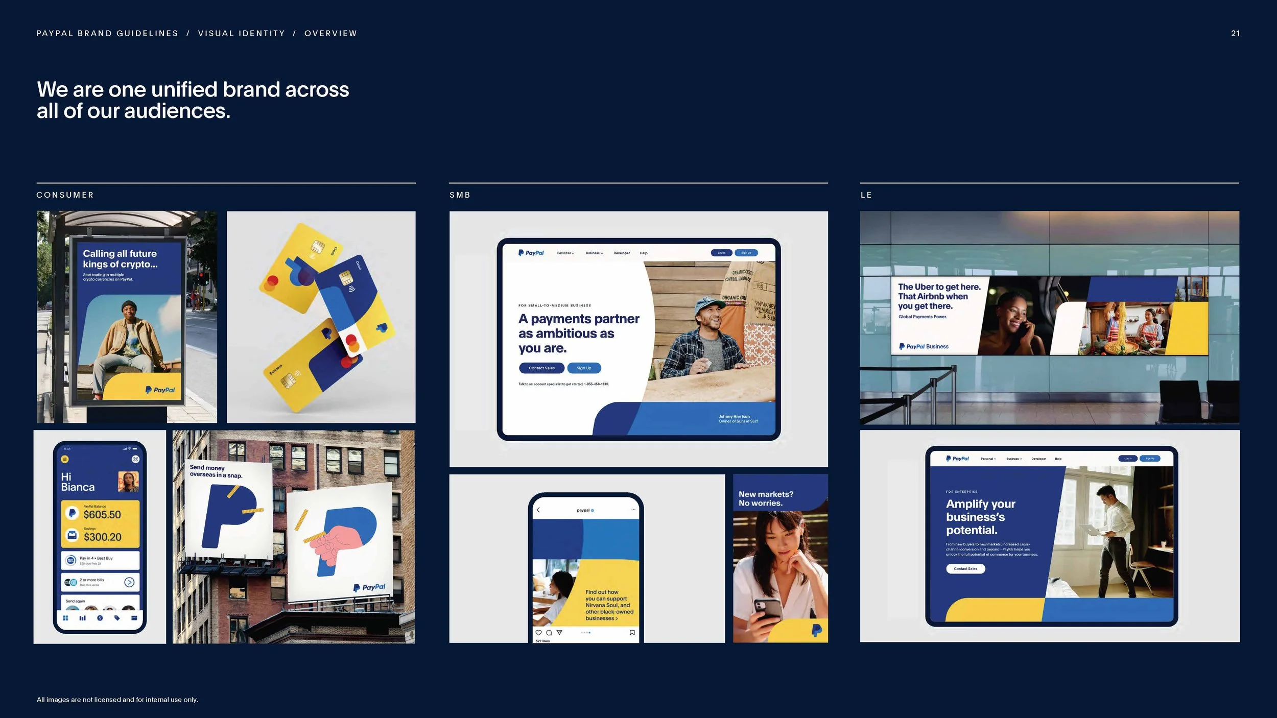
PayPal had recently completed a rebrand with a separate agency. The new brand identity new logo, color palette, typography, and graphic language was signed off and ready. What wasn't ready was any guidance for how it should live online.The brand guidelines themselves were minimal in their depiction of digital. They showed the brand in print, in campaign, in out-of-home, but translating that into responsive web components, interaction patterns, and a scalable page system was undefined. That translation was our work to figure out.
The system had to be built while shipping
They needed someone to take that brand and apply it across their entire website: desktop and mobile, across all three customer segments: Consumer, SMB and Enterprise. A large-scale rollout with one critical constraint: don't disrupt the existing site. Pages needed to launch incrementally, keeping the live website functional throughout.
Enable flexible, cohesive storytelling
We had to solve for unique, bespoke storytelling while designing for components. With three customer segments and dozens of page types, every page needed its own narrative, and getting that right mattered as much as the visuals. We needed components built for rich storytelling: flexible enough to carry whatever our messaging called for, but structured to flow naturally.
02 My role
I worked as design lead across Consumer, SMB, Financial Services, and Business Operations, moving between system-level thinking and page-level execution depending on where I was needed. Managed the Accenture Song team as well as designers from PayPal as one cohesive team.
Led the visual exploration that defined how the brand's shape language would work in web contexts we explored 100+ directions before landing on the rules that underpinned every page
Defined and built the full component set that accommodated the new brand across all four phases
Contributed to the architecture decision to build composable sections rather than full page templates
Owned design execution across multiple pages in each phase
Participated in bi-weekly office hours with PayPal's internal design system team, shared updates, fielded questions on component behavior, proposed new additions
Led our daily stand-ups, weekly retros and client presentations
03 Research & explorations
There was no existing precedent for how the brand should behave on the web, so we explored how the new brand could be systematically adopted for online use.
![Accenture_Song_PayPal_CaseStudy_Jumpstart [Autosaved] 2.003.jpeg](https://images.squarespace-cdn.com/content/v1/5290e19ae4b06ae3d2a715c0/1782857861039-XTYLTFZ944PJX4UJX5Q8/Accenture_Song_PayPal_CaseStudy_Jumpstart+%5BAutosaved%5D+2.003.jpeg)
![Accenture_Song_PayPal_CaseStudy_Jumpstart [Autosaved] 2.002.jpeg](https://images.squarespace-cdn.com/content/v1/5290e19ae4b06ae3d2a715c0/1782857861039-269B0TY8F383XY7SD8BL/Accenture_Song_PayPal_CaseStudy_Jumpstart+%5BAutosaved%5D+2.002.jpeg)
![Accenture_Song_PayPal_CaseStudy_Jumpstart [Autosaved] 2.001.jpeg](https://images.squarespace-cdn.com/content/v1/5290e19ae4b06ae3d2a715c0/1782857862395-2GF4ASJRB16GF8ZIPUKQ/Accenture_Song_PayPal_CaseStudy_Jumpstart+%5BAutosaved%5D+2.001.jpeg)
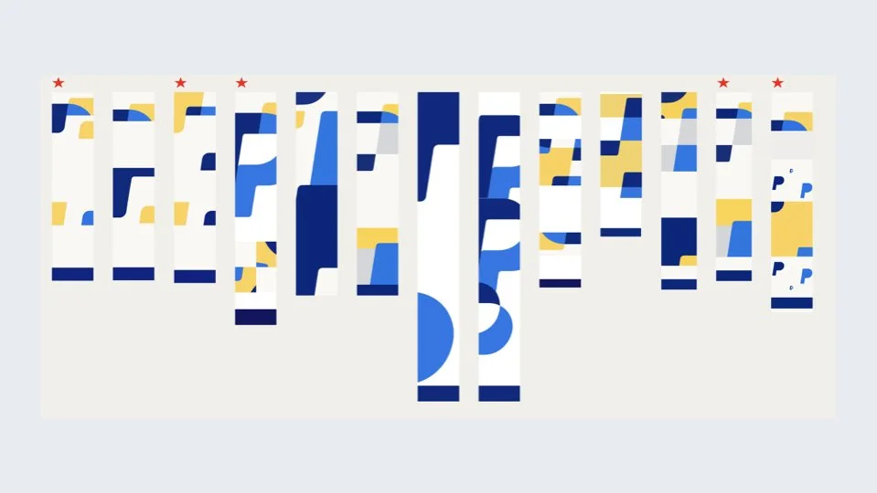
I led an exploration of 100+ layout directions for how the brand's shape language could translate to web. Each direction tested a different scale, position, pairing with photography or product UI, and color combination. The goal was to find where the brand's boldness broke down on screen, and what constraints would fix it.
04 Approach & designs
The exploration phase led to three concrete decisions that shaped the system.
Shape rules
From the 100+ direction exploration, four rules emerged as the foundation of the graphic shape fragment in the design system:
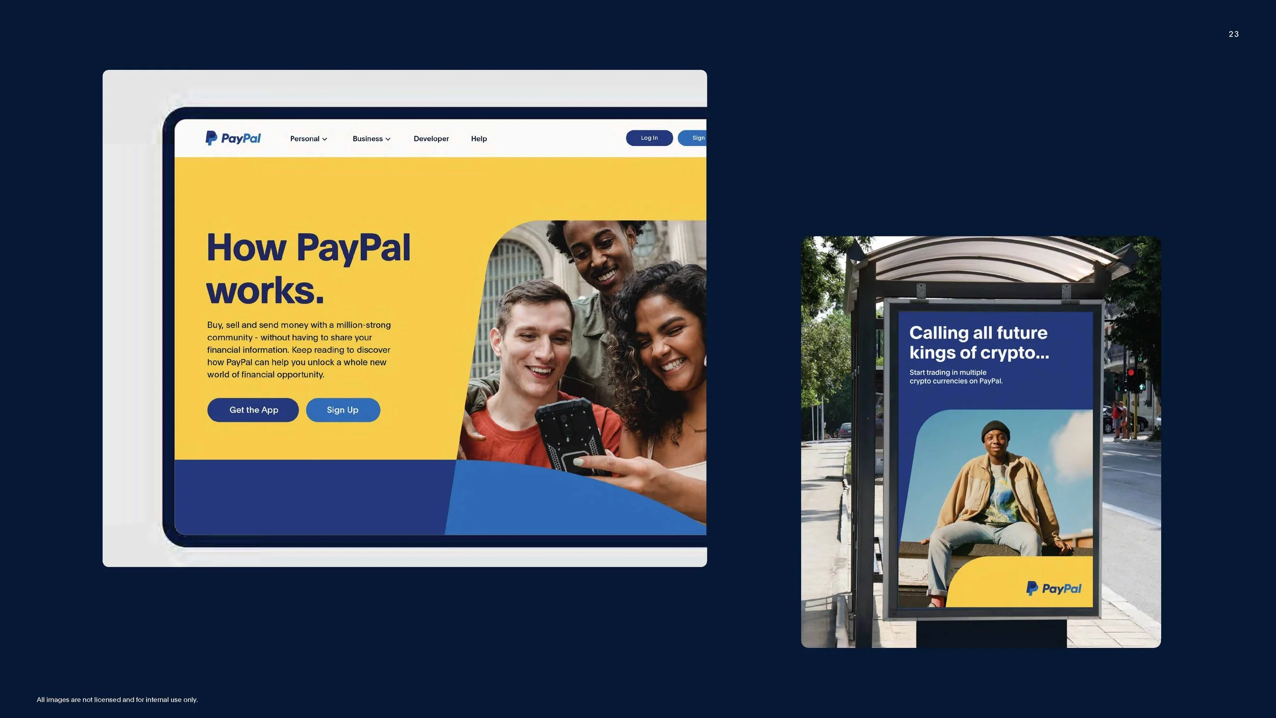
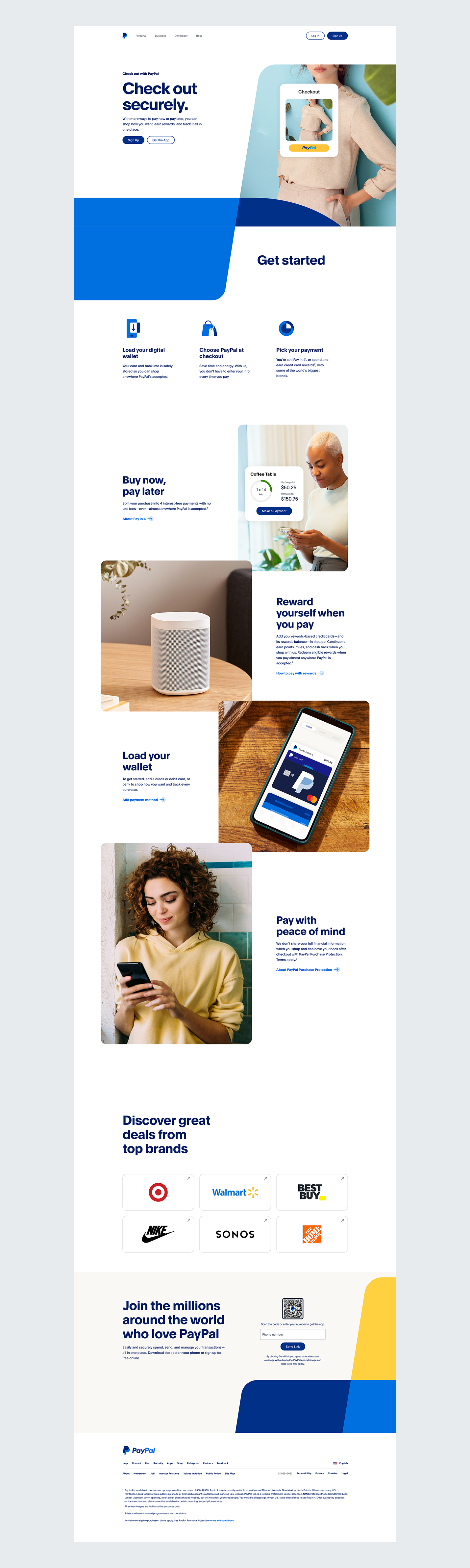
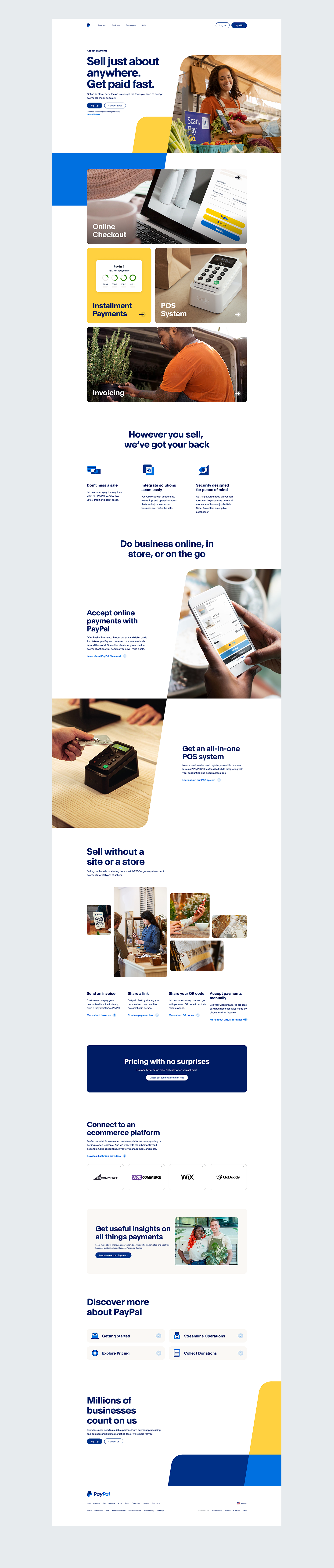
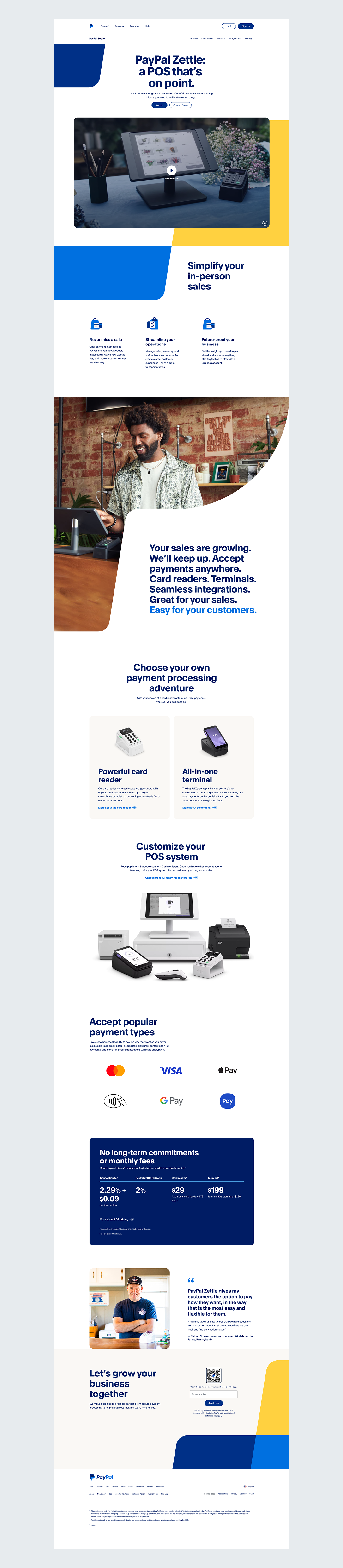
Shapes are always based on the PayPal P. The P-mark became the structural basis for every graphic shape across the site. Shapes derived from its form are used to house photography, apply brand color, and draw the eye to key areas of a page. They're never decorative for its own sake, every shape is doing one of those three jobs.
Shapes use continuation. Rather than appearing as isolated graphic elements, shapes taper into adjacent sections creating a visual flow that carries the eye down the page naturally. The shape connects sections and keeps the brand present without competing with content.
Color pairings are defined. Shape and color combinations are documented rather than left open to interpretation. With a 15-person team shipping across 70+ pages undocumented color decisions would have created inconsistency. Defining the pairings upfront meant the system held together without anyone having to police it.
Sections library over page templates
Early on there was a pull toward full page templates — faster to design, easier to hand off. We pushed back. PayPal's content team needed to update pages after launch, a 15-person team across 4 phases would create inconsistency building from different templates, and a fixed template would need rebuilding every time a page's content structure didn't fit.
We built a composable sections library instead — 30 core components, 100+ variants — that let any team assemble a page suited to its own story while staying visually consistent with every other page on the site.